دریافت پوسٹس
ہمارے Discover صفحہ پر دلکش مواد اور متنوع نقطہ نظر کو دریافت کریں۔ تازہ خیالات کو اجاگر کریں اور بامعنی گفتگو میں مشغول ہوں۔


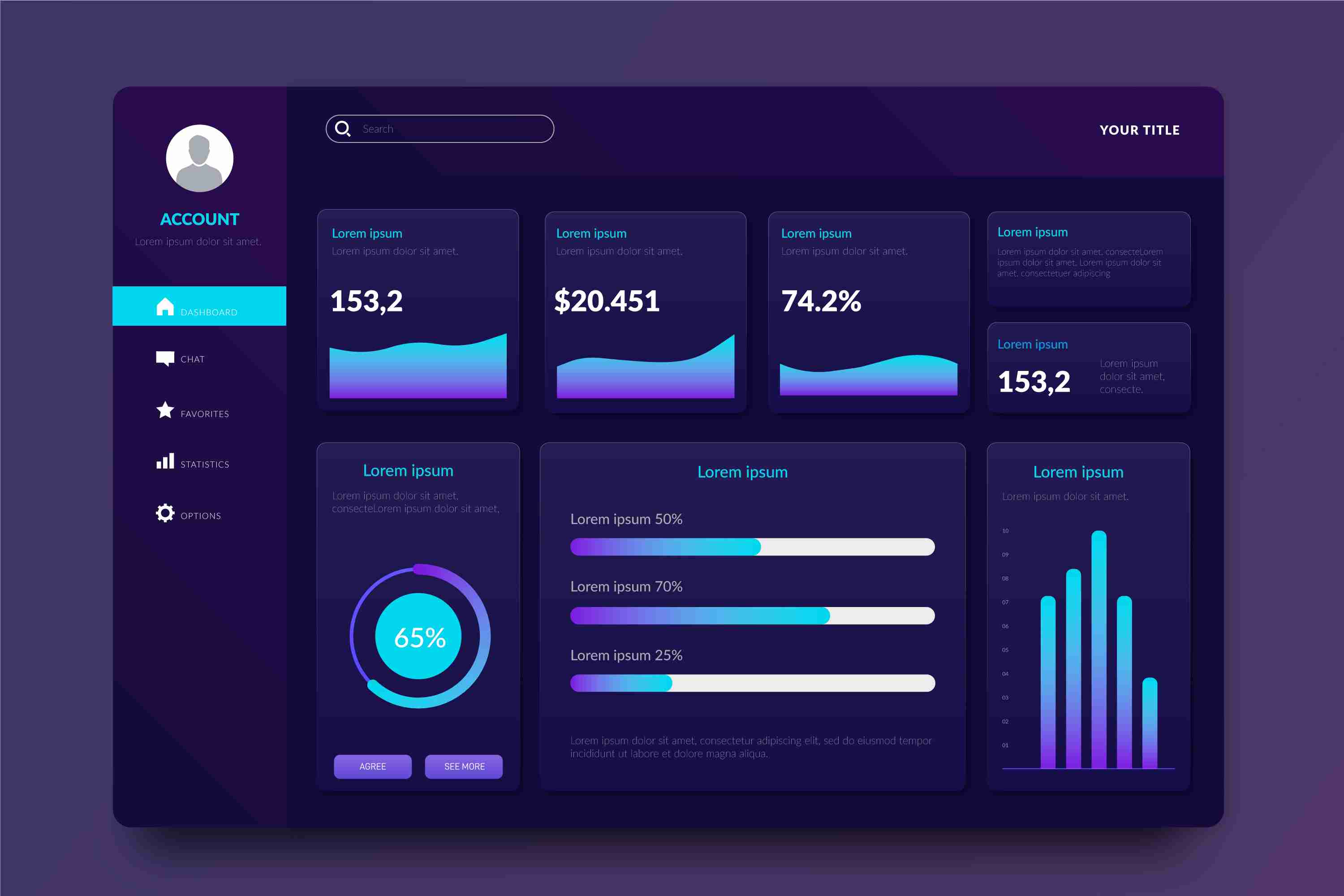
Interactive Data Visualization with Power BI — Turning Raw Data Into Clear Insights
Today, companies generate more data than ever before. Sales records, marketing analytics, customer behavior, operations reports, financial statements — everything is measured, tracked, and recorded. But collecting data is only the first step. What truly matters is the ability to understand that data quickly and turn it into meaningful insights. This is where interactive data visualization becomes essential, and Power BI is one of the most effective tools available for this purpose.
Static Reports Don’t Tell the Full Story
Traditional reports, spreadsheets, and static charts provide limited visibility. They show what happened, but they don’t help you investigate *why* it happened. They don’t adjust based on user needs. If you want to compare performance across regions or understand market trends over time, manual reports take too long and often end up filled with errors.
Static charts become outdated soon after they’re created. By the time they reach decision-makers, the data may no longer reflect the current situation. This delay slows down responses, and opportunities are missed. Modern businesses operate too quickly for slow, manual workflows.
What Power BI Does Differently
Power BI provides interactive dashboards that allow people to see, explore, and understand data in real time. Instead of scrolling through endless tables or waiting for monthly reports, users can instantly filter, drill down, or adjust the view based on their needs.
With Power BI, you can:
* Bring together data from multiple sources into a single dashboard.
* Use dynamic visuals like charts, maps, graphs, and trend lines.
* Explore data with filters, slicers, drill-throughs, and comparisons.
* Update dashboards automatically with real-time or scheduled refreshes.
* Share insights across teams to maintain consistent understanding.
This eliminates the limitations of static reporting and replaces them with a living, interactive system that evolves with your business.
Why Interactive Visualization Matters
**Clearer Insights and Faster Decisions**
Interactive dashboards make it easy to spot patterns that might be hidden in traditional tables. Color-coded visuals help users instantly see highs, lows, trends, and anomalies. Leaders can make quicker, more confident decisions because they see the full picture at a glance.
**Better Collaboration Across Teams**
When everyone works with the same dashboard, confusion disappears. Marketing, finance, operations, and leadership all access the same data — but each team can explore it according to their needs. This alignment strengthens teamwork and improves decision-making.
**Eliminates Manual Work**
Instead of creating multiple reports every week or month, a single Power BI dashboard updates automatically. This saves hours of manual effort and reduces the risk of human error.
**Scalable for All Business Sizes**
Whether it’s a small business analyzing sales or a large enterprise visualizing multiple departments, Power BI scales smoothly. As data increases, the dashboard continues to perform without slowing down.
How Different Teams Benefit
**Sales Teams**
They can track revenue, product performance, sales growth, customer segments, and forecast trends — all from one dashboard. Instead of relying on outdated spreadsheets, sales managers can evaluate performance instantly.
**Marketing Teams**
They can analyze website traffic, campaign performance, conversion rates, and customer behavior. Comparisons between campaigns, channels, and regions help refine strategies.
**Operations & Supply Chain**
Teams can monitor delivery times, resource utilization, production output, inventory levels, and bottlenecks. With real-time visibility, problems can be solved before they escalate.
**Finance Departments**
Financial data becomes easier to analyze. Profit margins, cash flow, expenses, and budget comparisons become more accessible through interactive visuals.
What Makes a Strong Power BI Dashboard
Creating a powerful dashboard requires thoughtful planning. Here are the key ingredients:
* **Start with clear objectives.** Define the questions the dashboard must answer.
* **Use visuals with purpose.** Don’t overload the screen with unnecessary charts.
* **Keep the layout clean and intuitive.** Group related metrics together.
* **Include filters for deeper exploration.** Allow users to view data from different angles.
* **Verify data accuracy.** A dashboard is only useful if the data behind it is reliable.
* **Review and update regularly.** Business priorities change, and dashboards should evolve accordingly.
Real-World Examples
A business can use Power BI to track customer acquisition, see performance by city, compare monthly growth, or identify which products are performing the best. A manufacturing company can monitor machine performance, breakdown trends, and production delays. Retailers can visualize sales by store, product category, or season.
In each case, the common theme is clarity. When data becomes visual and interactive, insights appear faster and more naturally.
Conclusion
Interactive data visualization has become a vital part of modern business intelligence. Power BI transforms raw data into meaningful, dynamic visuals that help teams understand performance, identify opportunities, and act quickly. Instead of depending on slow, static reports, businesses gain the advantage of live, interactive dashboards that offer clarity and speed.
When organizations adopt interactive visualization, they move toward smarter, more informed decision-making. Data becomes easier to understand, insights become clearer, and teams work together more effectively. In a world driven by information, Power BI helps businesses turn data into a strategic strength.
More Info:https://www.knowledgeexcel.com..../blogs/data-visualiz
پسند
تبصرہ
بانٹیں
پسند
تبصرہ
بانٹیں
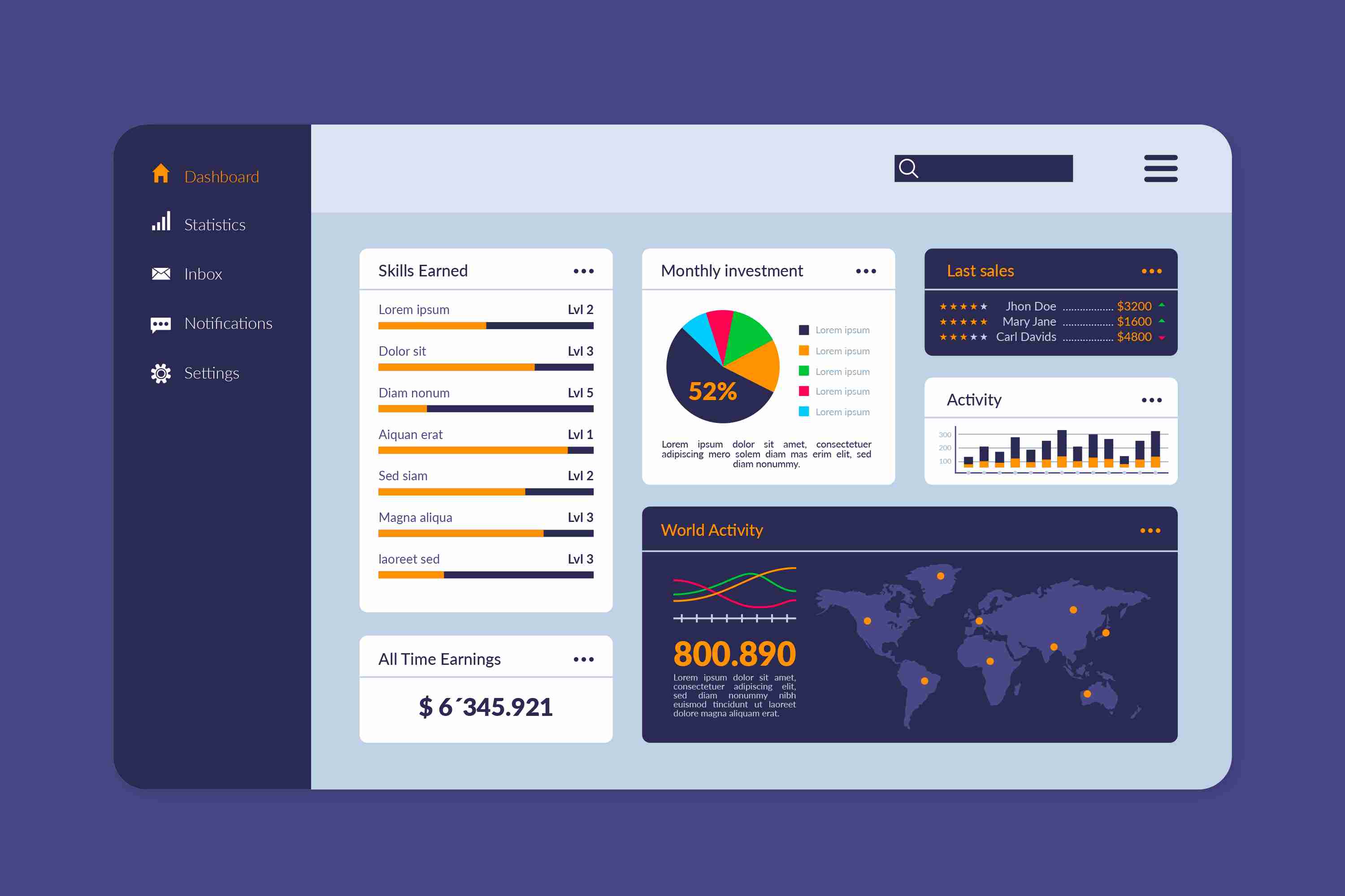
**Power BI Finance Dashboard — A Smarter Way to Manage Your Financial Data**
In today’s fast-moving business environment, finance teams cannot rely on slow, manual reporting methods. Data is coming in from multiple places—accounting software, sales systems, spreadsheets, and operational tools—making it difficult to maintain clarity. This is where a Power BI Finance Dashboard becomes a powerful asset. It gives you a single, intelligent view of your entire financial landscape, updated in real time and designed to simplify the way you analyze and manage financial performance.
**What Is a Power BI Finance Dashboard?**
A Power BI Finance Dashboard is an interactive financial reporting solution that turns raw financial data into visual insights. Instead of scrolling through endless sheets or handling duplicate files, you get a beautifully organized set of charts, graphs, KPI cards, and summaries that reflect your business’s financial health. The dashboard gathers data from various sources and refreshes automatically, so your numbers are always accurate, always up to date, and always ready for analysis.
It transforms the way finance teams work. You can filter by month, year, department, or project. You can drill down into specific cost centers or compare budget against actual performance in a few clicks. This makes financial reporting not just faster, but a lot more meaningful.
**Why Businesses Need a Finance Dashboard**
**1. Real-Time Visibility**
Finance decisions cannot wait for weekly or monthly reports. With a Power BI dashboard, every important metric—revenue, expenses, cash flow, profitability—updates instantly. If expenses rise unexpectedly or revenue dips, you see it immediately. This real-time awareness allows teams to respond faster and more accurately.
**2. Handles Complex and High-Volume Data**
Spreadsheets become slow or unreliable when the data grows large. Power BI is designed to manage millions of rows smoothly. This makes it ideal for companies with multiple branches, high transaction volumes, or separate business units that need consolidated reporting.
**3. Easier to Understand Through Visuals**
Numbers alone can be overwhelming. The real power of this dashboard lies in its visuals. Charts, graphs, waterfall visuals, trend lines, and KPI cards convert complex data into a story you can understand in seconds. Even non-finance teams understand the insights quickly without needing technical expertise.
**4. Reduces Manual Work and Eliminates Errors**
Traditional reporting often involves manual data consolidation—copying, cleaning, formatting, and verifying. It consumes hours and increases the chances of human error. A Power BI Finance Dashboard automates the entire process. Once the dashboard is set up, your reports refresh automatically, saving time and ensuring consistency.
**5. Improves Collaboration**
Everyone—from senior leadership to finance analysts—sees the same, centralized financial view. There are no conflicting numbers, no outdated files, and no version-control issues. Access can be restricted based on roles, ensuring security while improving transparency and teamwork.
**Key Metrics You Can Track**
A finance dashboard can track a wide range of financial KPIs, including:
* **Revenue and sales performance** across periods
* **Gross and net profit margins**
* **Operating expenses and cost breakdowns**
* **Cash flow—both inflow and outflow trends**
* **Budget vs actual performance**
* **Department-wise or project-wise cost analysis**
* **Overheads, variances, and cost optimization areas**
* **Receivables and payables aging**
These metrics help businesses understand how well they are performing, where money is being spent, and what financial strategies need adjusting.
**Designing an Effective Finance Dashboard**
A good dashboard is more than just visuals; it must be structured with clarity and purpose. Here are key principles:
* **Start with the audience.** A CFO needs a high-level overview, while a finance controller may require deep dive views. Customizing each dashboard for its users improves the value it delivers.
* **Tell a clear financial story.** Start with revenue, follow with expenses, add margins, and conclude with cash flow and trends. A logical flow enhances understanding.
* **Avoid clutter.** Too many visuals create confusion. A clean dashboard with essential KPIs works best. Use drill-downs for detailed exploration.
* **Ensure data quality and security.** Financial data is sensitive. Proper governance and role-based access maintain confidentiality while ensuring accuracy.
**Who Benefits From a Finance Dashboard?**
A Power BI Finance Dashboard benefits businesses of every size:
* **Startups and small businesses** gain clarity on cash flow and cost control.
* **Growing companies** can consolidate multiple data sources and monitor performance across departments.
* **Large enterprises** benefit from multi-entity consolidation, advanced forecasting, and streamlined financial reporting across teams.
Regardless of scale, the dashboard empowers teams to move from reactive reporting to proactive financial planning.
**Conclusion**
A Power BI Finance Dashboard is more than just a reporting tool—it’s a strategic asset. It simplifies financial analysis, reduces workload, improves accuracy, and gives decision-makers a real-time view of financial health. With clear visuals, automated reporting, and interactive insights, finance teams can shift their focus from manual tasks to strategic financial planning.
In an era where data influences every decision, a dynamic, reliable finance dashboard ensures your business stays informed, agile, and ready for growth.
More Info:https://www.knowledgeexcel.com..../power-bi/finance-da
پسند
تبصرہ
بانٹیں

پسند
تبصرہ
بانٹیں
پسند
تبصرہ
بانٹیں
Buy Land Near Jewar Airport for Future Growth | Maxpine Group
Click Now:-https://www.adpost4u.com/real-....estate/land/1054309/
#buyinglandnearjewar Airport is a smart move for future-focused investors. Maxpine Group offers premium, well-planned plots located in the fastest-growing airport zone of NCR. With clear documentation, excellent connectivity, and high appreciation potential, our land options are perfect for both residential and investment goals.

پسند
تبصرہ
بانٹیں
Understanding Sensitive Teeth: Causes, Symptoms, and Effective Treatments
Tooth sensitivity can start once the hard outer later, known as enamel, or protective middle layer, dentin, is worn down enough that inner part has been exposed.
Learn More- https://www.sociomix.com/c/ugc..../understanding-sensi
پسند
تبصرہ
بانٹیں
Understanding Sensitive Teeth: Causes, Symptoms, and Effective Treatments
Tooth sensitivity can start once the hard outer later, known as enamel, or protective middle layer, dentin, is worn down enough that inner part has been exposed.
Learn More- https://articleproductions.com..../understanding-sensi
پسند
تبصرہ
بانٹیں
7 Must-Know Tips Before Starting Invisalign Treatment
Most people think Invisalign is totally see-through, but many treatments include attachments tiny enamel-colored bumps that make it easier for the trays to grip and move your teeth.
Learn More- https://slimwiki.com/keller-an....d-wainwright-orthodo
پسند
تبصرہ
بانٹیں
Showing 1568 out of 4218