Power bi interactive dashboard : turning data into smart decisions
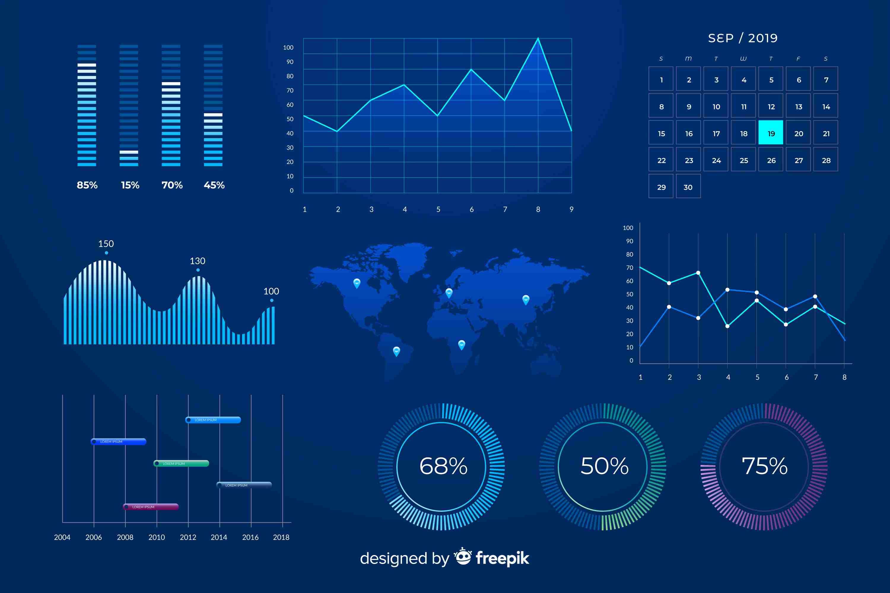
In today’s data-driven world, businesses are collecting more information than ever before. But raw data alone doesn’t tell a story—it’s only when you visualize it that real insights come to life. That’s where **interactive data visualization in Power BI** steps in, transforming complex datasets into meaningful visuals that empower teams to make smarter, faster, and more confident decisions.
At **Knowledge Excel**, the goal is simple: to help businesses turn static data into actionable insights through Power BI’s powerful visualization capabilities.
---
**Why Interactive Data Visualization Matters**
Static charts and spreadsheets can show numbers, but they don’t provide clarity or engagement. Interactive data visualization, on the other hand, allows users to explore information dynamically—filtering, drilling down, and identifying patterns in real time.
When businesses make their data interactive, they’re not just looking at results—they’re asking questions, finding causes, and predicting outcomes. This helps decision-makers go beyond “what happened” to uncover “why it happened” and “what’s next.”
Whether you’re in finance, sales, marketing, or operations, interactive dashboards help you spot trends early and respond quickly, making them a must-have tool in today’s competitive landscape.
---
**How Power BI Enables Interactive Visualization**
**Microsoft Power BI** has become a leader in business intelligence because of its user-friendly design and strong analytical capabilities. It allows organizations to connect to multiple data sources, clean and model their data, and visualize it using intuitive dashboards.
Here’s how Power BI makes data visualization interactive and impactful:
**1. Real-Time Data Refresh**
Power BI automatically updates dashboards with the latest data. This ensures that reports always reflect the most current business situation, eliminating the delays caused by manual updates.
**2. Drill-Down and Cross-Filtering**
Users can click on visuals to filter related charts, making it easier to identify trends and relationships. For example, clicking on a region’s sales data instantly updates charts for product performance or customer segments in that area.
**3. Customizable Dashboards**
Every organization has unique needs. Power BI allows users to create custom dashboards that focus on key metrics such as revenue, expenses, profit, and ROI—tailored for different departments or leadership roles.
**4. AI-Powered Insights**
Power BI goes beyond visualization. Its AI features can detect anomalies, forecast trends, and provide suggestions based on patterns, helping teams make predictive decisions rather than reactive ones.
**5. Mobile-Friendly Access**
With Power BI’s responsive design, dashboards are accessible anytime and anywhere—from desktop to mobile devices—keeping teams informed and connected on the go.
---
**The Business Benefits of Interactive Visualization**
**1. Enhanced Decision-Making**
Interactive dashboards turn data into a story. Executives and managers can easily explore financial performance, track KPIs, and understand variances in real time, leading to faster and more informed decisions.
**2. Time Efficiency**
Automating data collection and visualization saves countless hours. Instead of preparing static reports, analysts can focus on interpreting results and advising on strategy.
**3. Increased Engagement**
When data is interactive, teams engage more with it. A visually appealing, dynamic dashboard is more likely to be explored than a lengthy spreadsheet.
**4. Improved Collaboration**
Power BI allows sharing of live dashboards across departments. This ensures every team—marketing, finance, operations, or HR—is aligned with the same data insights, promoting collaboration and transparency.
**5. Data Accuracy and Consistency**
Since Power BI pulls data from centralized, verified sources, it minimizes human error and ensures that everyone is working with accurate, up-to-date information.
---
**Applications Across Business Functions**
Interactive data visualization with Power BI can be applied across various departments:
* **Finance* Track budgets, expenses, and profitability in real time.
* **Sales* Identify top-performing products, regions, and customer behaviors.
* **Marketing* Measure campaign performance and ROI across multiple channels.
* **Human Resources* Visualize workforce trends, employee turnover, and training ROI.
* **Operations* Monitor supply chain efficiency, inventory levels, and process performance.
This cross-functional flexibility makes Power BI one of the most versatile visualization tools for modern organizations.
---
**Best Practices for Building Interactive Dashboards**
To make the most of Power BI’s visualization potential, follow these best practices:
1. **Focus on the Objective* Every dashboard should answer a specific business question. Avoid overloading it with unnecessary data.
2. **Use Clear Visuals* Choose chart types that make comparisons easy—bar charts, line graphs, and maps work better than complex visuals.
3. **Enable Interactivity* Use filters, slicers, and drill-throughs to make dashboards more exploratory.
4. **Maintain Data Quality* Ensure data sources are clean and reliable before visualization.
5. **Keep it Simple* A well-structured dashboard should be easy to navigate and interpret for both technical and non-technical users.
When designed thoughtfully, an interactive Power BI dashboard becomes more than just a report—it becomes a storytelling tool for the entire organization.
---
**Conclusion**
Interactive data visualization in Power BI is redefining how businesses interpret and act on data. By turning raw information into clear, engaging visuals, Power BI helps organizations unlock deeper insights, encourage collaboration, and enhance decision-making across all levels.
In a data-driven world, the difference between success and stagnation lies in how well you understand your data. With interactive Power BI dashboards, businesses gain the power to not just view their numbers, but to explore, question, and innovate.
If your goal is to transform your data into a strategic advantage, **Power BI interactive visualization** is the smartest path forward.
More info:https://www.knowledgeexcel.com..../blogs/data-visualiz