Interactive Data Visualization with Power BI — Turning Raw Data Into Clear Insights
Today, companies generate more data than ever before. Sales records, marketing analytics, customer behavior, operations reports, financial statements — everything is measured, tracked, and recorded. But collecting data is only the first step. What truly matters is the ability to understand that data quickly and turn it into meaningful insights. This is where interactive data visualization becomes essential, and Power BI is one of the most effective tools available for this purpose.
Static Reports Don’t Tell the Full Story
Traditional reports, spreadsheets, and static charts provide limited visibility. They show what happened, but they don’t help you investigate *why* it happened. They don’t adjust based on user needs. If you want to compare performance across regions or understand market trends over time, manual reports take too long and often end up filled with errors.
Static charts become outdated soon after they’re created. By the time they reach decision-makers, the data may no longer reflect the current situation. This delay slows down responses, and opportunities are missed. Modern businesses operate too quickly for slow, manual workflows.
What Power BI Does Differently
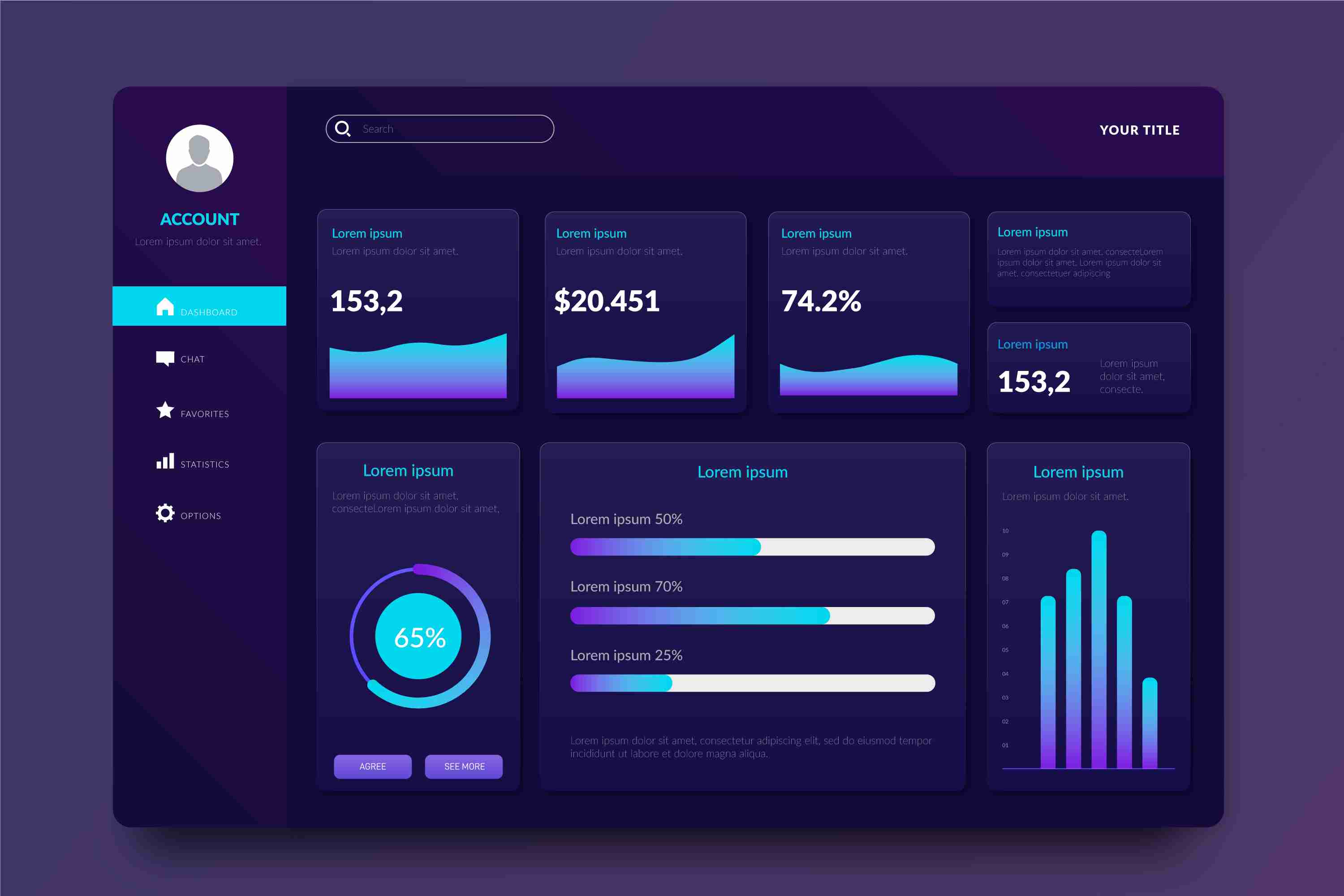
Power BI provides interactive dashboards that allow people to see, explore, and understand data in real time. Instead of scrolling through endless tables or waiting for monthly reports, users can instantly filter, drill down, or adjust the view based on their needs.
With Power BI, you can:
* Bring together data from multiple sources into a single dashboard.
* Use dynamic visuals like charts, maps, graphs, and trend lines.
* Explore data with filters, slicers, drill-throughs, and comparisons.
* Update dashboards automatically with real-time or scheduled refreshes.
* Share insights across teams to maintain consistent understanding.
This eliminates the limitations of static reporting and replaces them with a living, interactive system that evolves with your business.
Why Interactive Visualization Matters
**Clearer Insights and Faster Decisions**
Interactive dashboards make it easy to spot patterns that might be hidden in traditional tables. Color-coded visuals help users instantly see highs, lows, trends, and anomalies. Leaders can make quicker, more confident decisions because they see the full picture at a glance.
**Better Collaboration Across Teams**
When everyone works with the same dashboard, confusion disappears. Marketing, finance, operations, and leadership all access the same data — but each team can explore it according to their needs. This alignment strengthens teamwork and improves decision-making.
**Eliminates Manual Work**
Instead of creating multiple reports every week or month, a single Power BI dashboard updates automatically. This saves hours of manual effort and reduces the risk of human error.
**Scalable for All Business Sizes**
Whether it’s a small business analyzing sales or a large enterprise visualizing multiple departments, Power BI scales smoothly. As data increases, the dashboard continues to perform without slowing down.
How Different Teams Benefit
**Sales Teams**
They can track revenue, product performance, sales growth, customer segments, and forecast trends — all from one dashboard. Instead of relying on outdated spreadsheets, sales managers can evaluate performance instantly.
**Marketing Teams**
They can analyze website traffic, campaign performance, conversion rates, and customer behavior. Comparisons between campaigns, channels, and regions help refine strategies.
**Operations & Supply Chain**
Teams can monitor delivery times, resource utilization, production output, inventory levels, and bottlenecks. With real-time visibility, problems can be solved before they escalate.
**Finance Departments**
Financial data becomes easier to analyze. Profit margins, cash flow, expenses, and budget comparisons become more accessible through interactive visuals.
What Makes a Strong Power BI Dashboard
Creating a powerful dashboard requires thoughtful planning. Here are the key ingredients:
* **Start with clear objectives.** Define the questions the dashboard must answer.
* **Use visuals with purpose.** Don’t overload the screen with unnecessary charts.
* **Keep the layout clean and intuitive.** Group related metrics together.
* **Include filters for deeper exploration.** Allow users to view data from different angles.
* **Verify data accuracy.** A dashboard is only useful if the data behind it is reliable.
* **Review and update regularly.** Business priorities change, and dashboards should evolve accordingly.
Real-World Examples
A business can use Power BI to track customer acquisition, see performance by city, compare monthly growth, or identify which products are performing the best. A manufacturing company can monitor machine performance, breakdown trends, and production delays. Retailers can visualize sales by store, product category, or season.
In each case, the common theme is clarity. When data becomes visual and interactive, insights appear faster and more naturally.
Conclusion
Interactive data visualization has become a vital part of modern business intelligence. Power BI transforms raw data into meaningful, dynamic visuals that help teams understand performance, identify opportunities, and act quickly. Instead of depending on slow, static reports, businesses gain the advantage of live, interactive dashboards that offer clarity and speed.
When organizations adopt interactive visualization, they move toward smarter, more informed decision-making. Data becomes easier to understand, insights become clearer, and teams work together more effectively. In a world driven by information, Power BI helps businesses turn data into a strategic strength.
More Info:https://www.knowledgeexcel.com..../blogs/data-visualiz